
Forza
A coffee brand built around a simple idea: creating is an act of strength, and coffee is the fuel.
- ClientForza Coffee Shop
- IndustryFood & beverage
- ScopeBrand identity
- Year2025
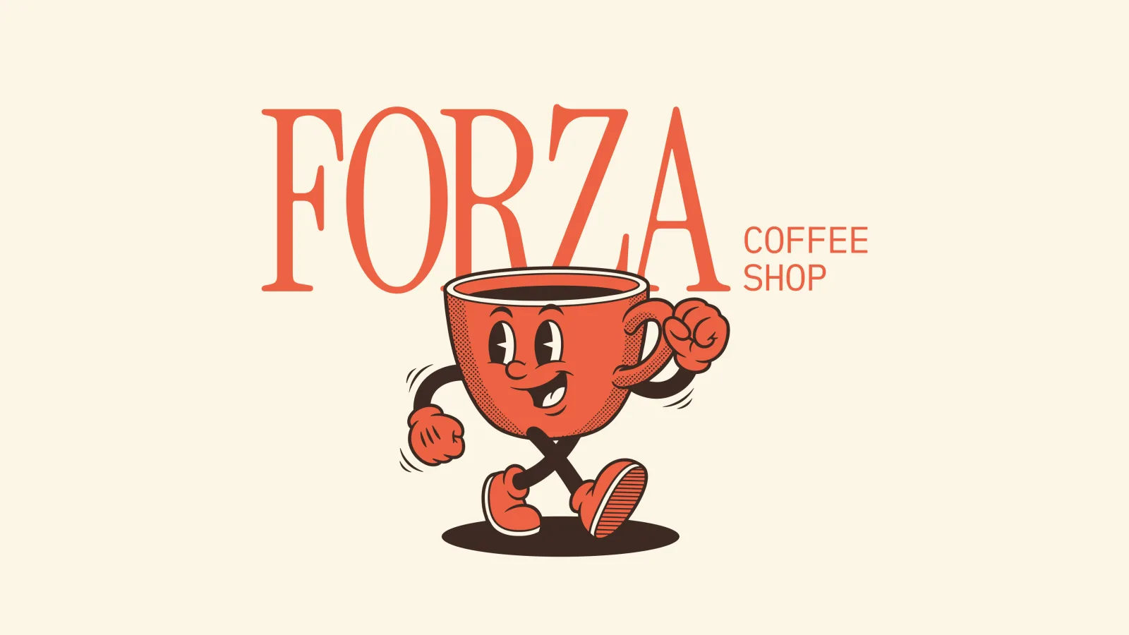
Forza opened into a market where every coffee shop looks the same: the same minimal sans-serif, the same beige palette, the same generic bean illustration. A new shop with no history has to earn trust from the storefront alone.
The brief was to make a brand-new business feel established from day one, with a personality distinctive enough to be remembered after a single visit.
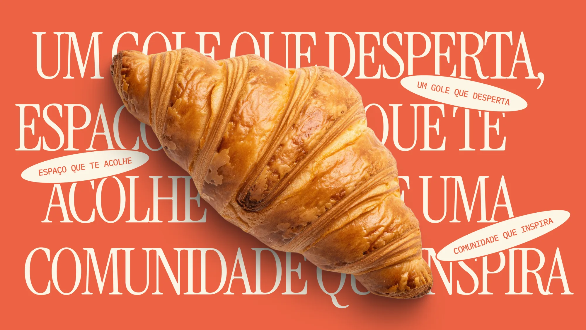
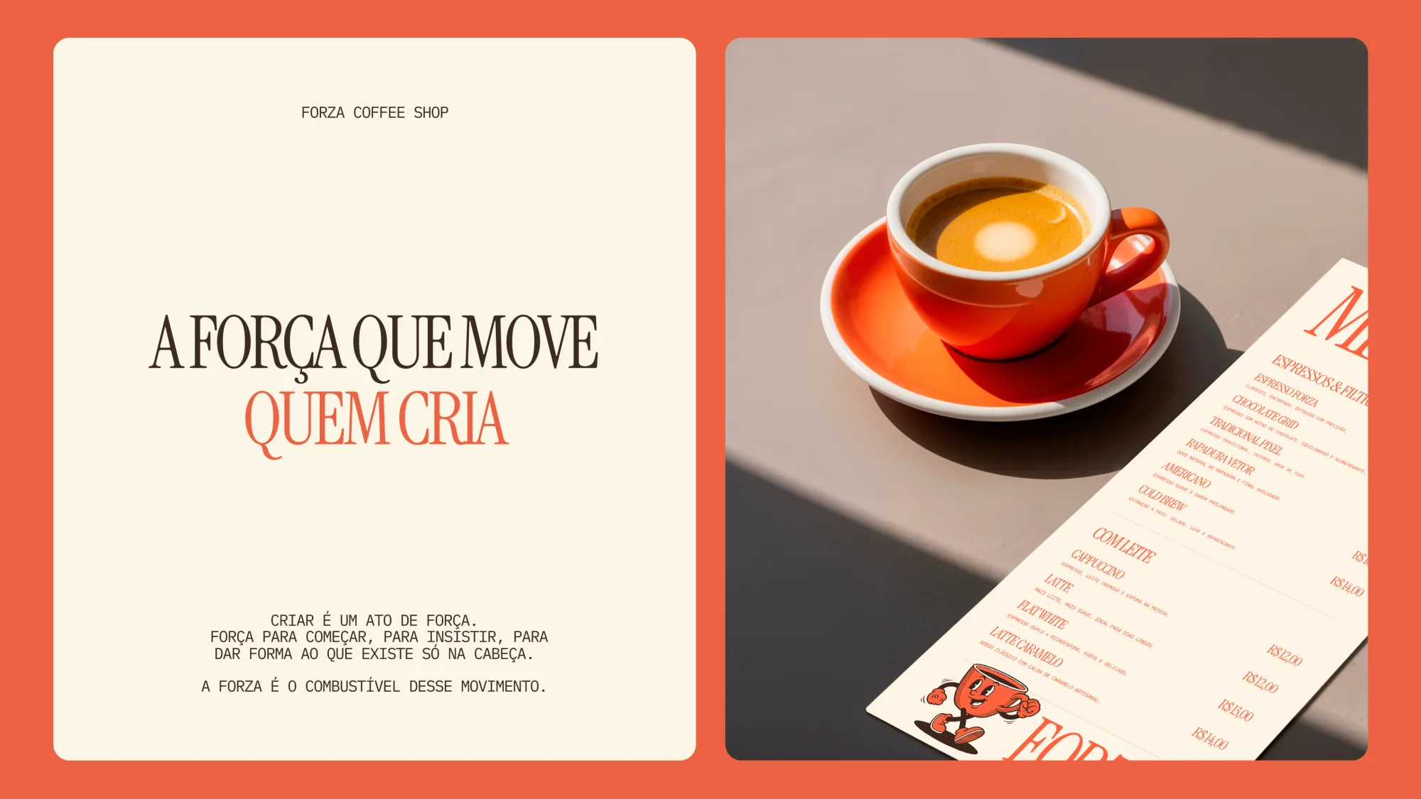
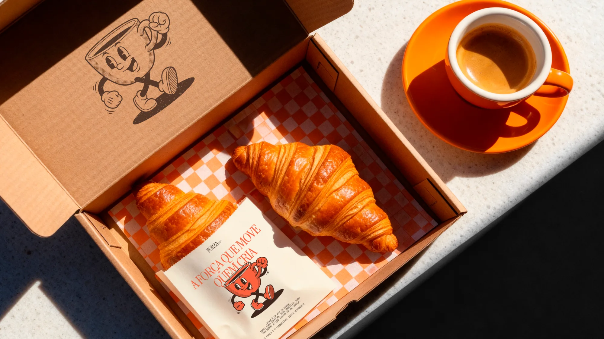
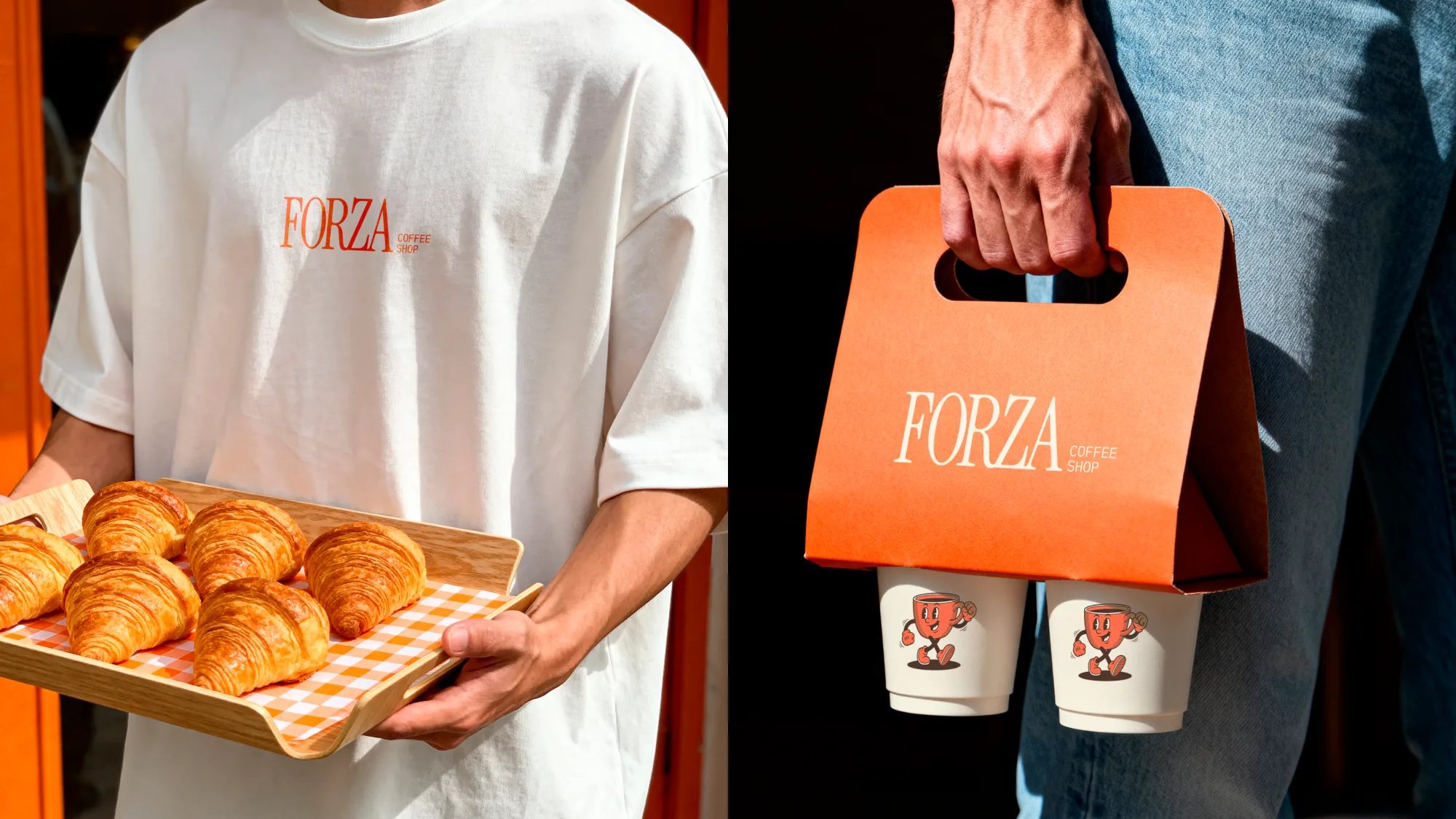
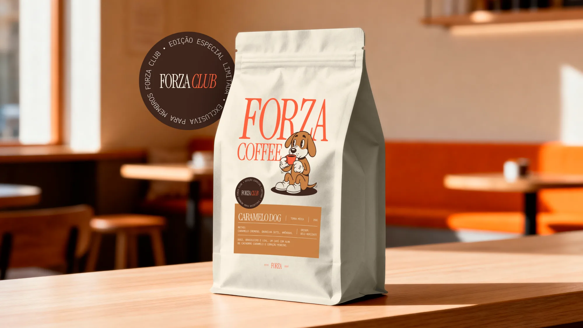
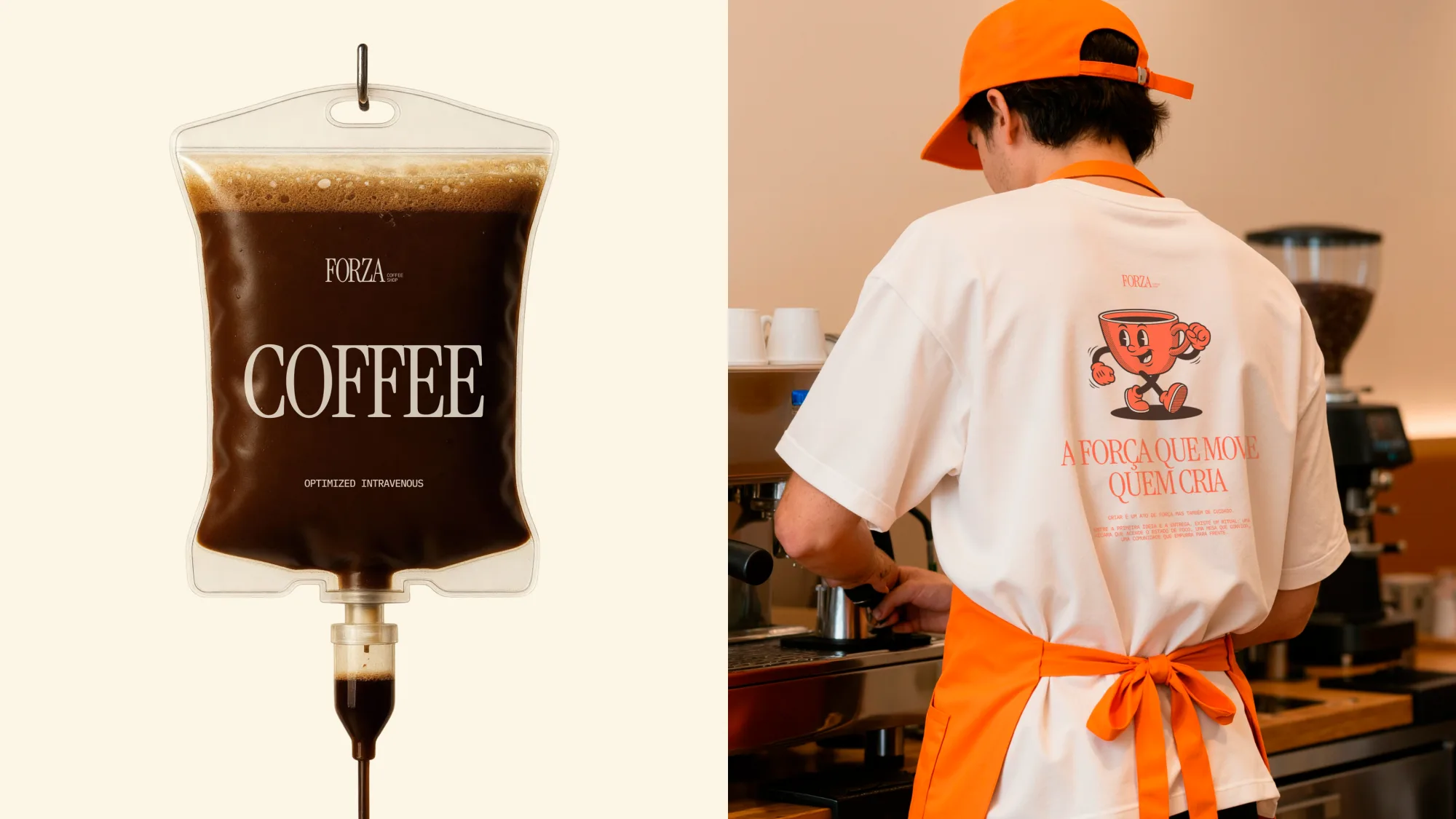
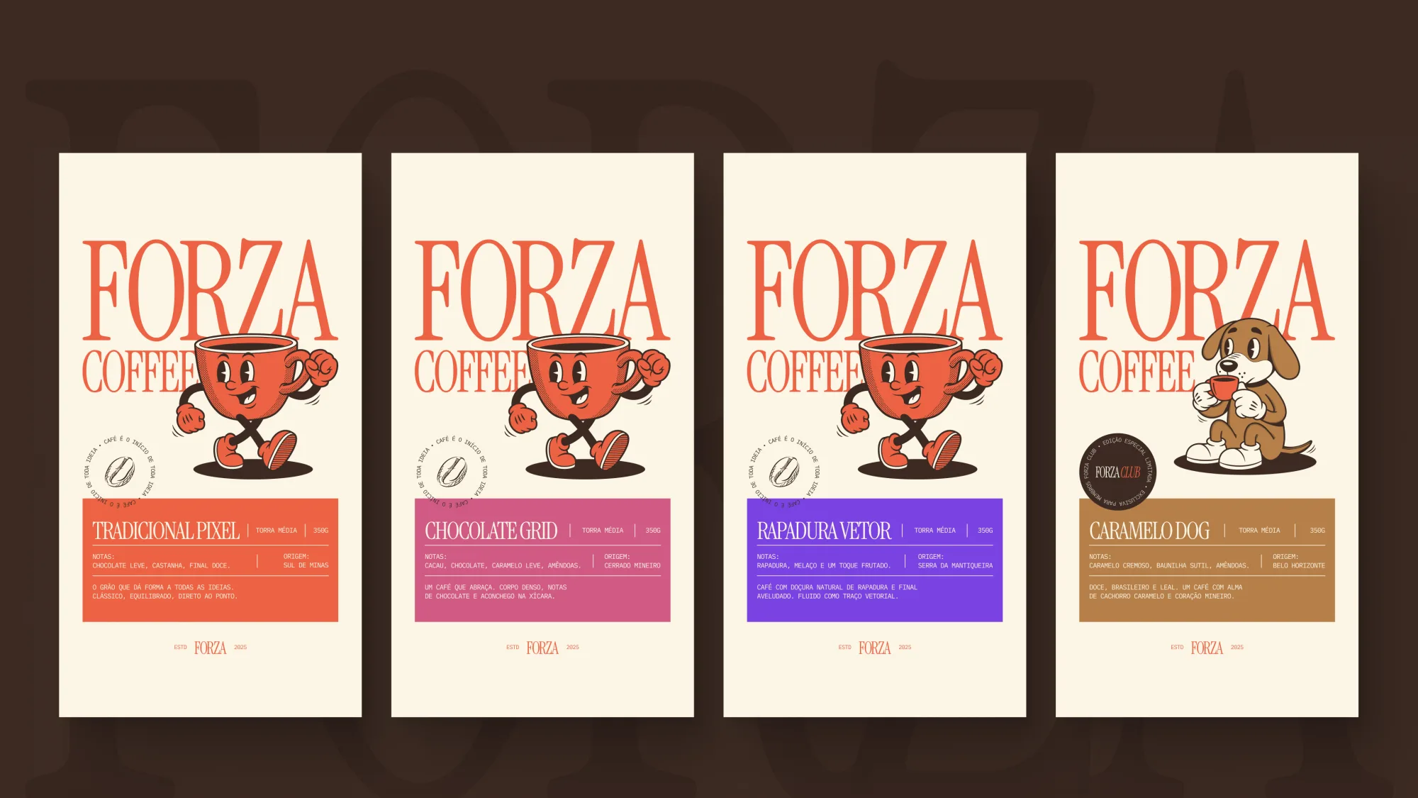
I anchored the identity in the brand's own manifesto, "a força que move quem cria", the force that moves those who create. Then I gave it a character to carry that energy: a running coffee cup drawn in a 1930s rubber-hose cartoon style.
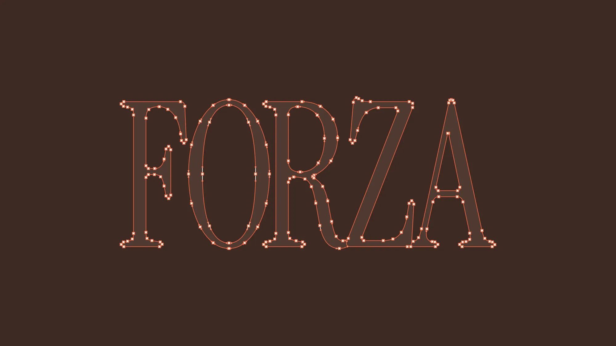
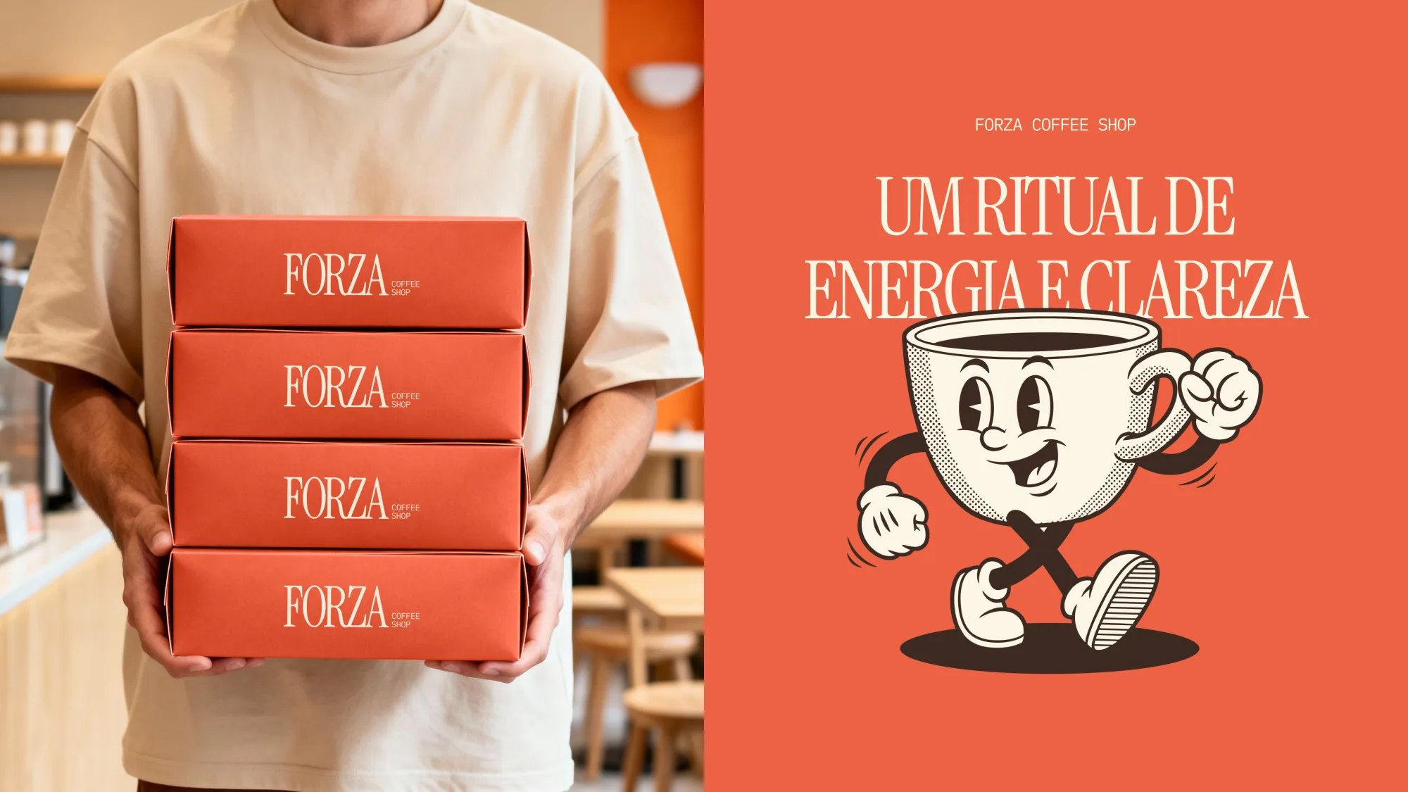
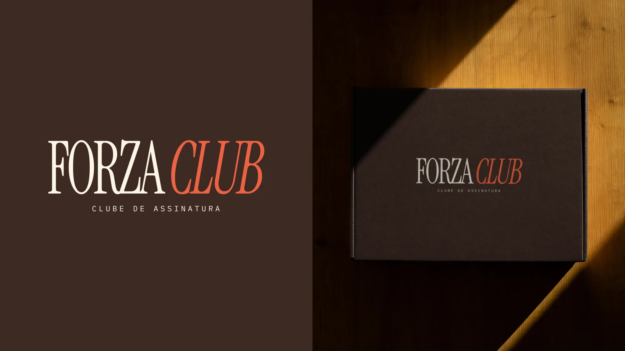
The mascot does the emotional work; a high-contrast display serif does the serious work. Together they let the brand be playful on a cup sleeve and confident on a storefront without switching personalities.
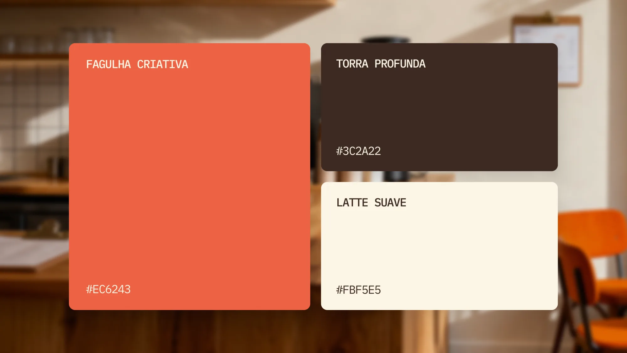
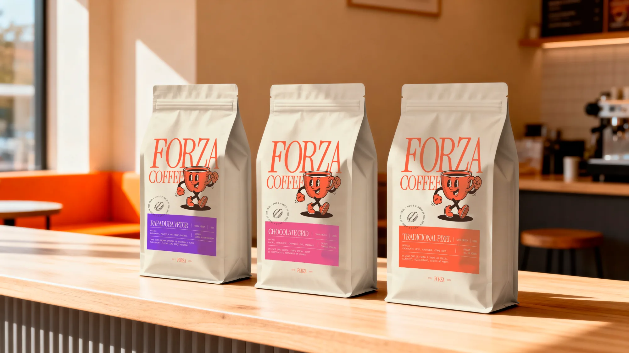
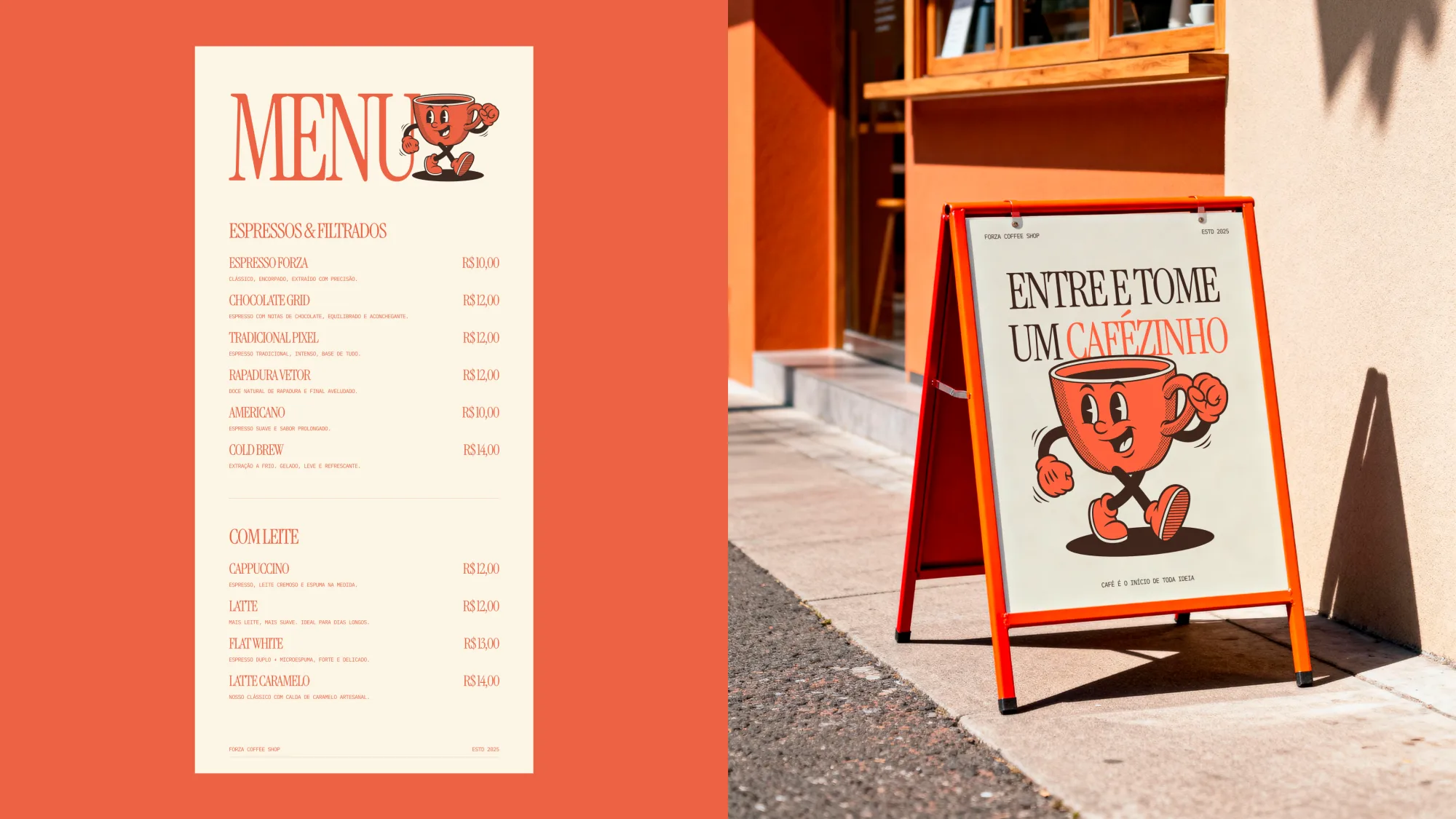
A two-color core (burnt orange on warm cream, grounded by deep brown) keeps production cheap and recognition high. Everything was built for real applications: cups, menus, signage, uniforms, packaging and social.
The result is a system a small team can run without a designer on call: clear rules for the mascot, the wordmark and the palette, and enough range that the brand stays alive across every touchpoint.
Next step
Let's build something
worth taking seriously.
Hiring for a design role, or need a brand and pages that convert? Tell me what you're working on. I reply within a day.
Remote · 30+ hrs/week · Available for US time zones